
The Psychology of Color in Signage
Published by Global Display Solution on September 10, 2020, 1:54 am
One of the most significant factors in how people understand the world is the way it looks. The way something is shaped or presented may or may not draw their attention. When it comes to advertising, color has a large effect on one’s perception of a product, person, or idea. That is why understanding the psychology of color in signage is so important to crafting the best marketing strategy for your business.
The Connection between Color and The Mind
The colors one sees make an impression on how they interpret the messages they receive from the world. One’s visual experience of an object or a message can fundamentally shape how they understand it—and color is one of the first things people notice about an item. For example, if you see a heart in the color red, you associate the symbol with love and passion. But if you see it in the color black, you may associate it with negativity or even death. How one perceives color meanings varies from culture to culture, but hue undeniably affects understanding.
The Meanings of Common Colors
Consider the interpretations of these common colors and how they relate to marketing ideas:
- Yellow: Optimistic and eye-catching. Great for window shopping.
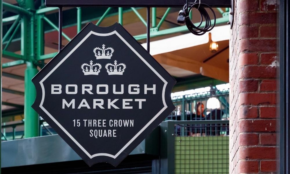
- Black: Sophisticated and alluring. Good for bold lettering and showing off luxury items.
- Red: Exciting and urgent. Best used for promoting sales, and it can even stimulate higher heart rates and appetite.
- White: Peaceful and clean. Can be used for representing pure-sourced items or for balancing out other colors in the background.
How to Use Color Psychology
Marketing strategies often utilize color psychology as the basis for various lettering and signage. Consider the product or service you’re trying to advertise—what emotions do you want to elicit, and what messages do you want to communicate? Color psychology is helpful not only in the design of your signage, but also in the overall presentation. Think about the style and color of the floor sign stands you use or the walls your signage will hang from. Like a beautiful picture in a bad frame, the context surrounding your color-planned signage can affect the overall messaging or drown out an otherwise attention-getting sign.
The words or ideas you shape in your marketing strategy are just as important as the way you present them. The next time you’re developing an advertisement campaign or crafting store signs, think about the psychology of color in signage. This will be a helpful way to quickly and subtly send the right message.